Art Prints · 5 min read · 15 June 2026
How to Print Digital Art Prints at Home (Without Blurry Results)
DPI, paper types, sizing, and shop vs home printing — so botanical and boho digital prints look clean, calm, and frame-ready.
Digital art prints should feel intentional on the wall — soft botanicals, geometric earth tones, line drawings with breathing room. Blurry edges and dull colour usually come from file misuse or paper mismatch, not from “bad art.” With a few careful choices, home or local-shop prints can look surprisingly close to the mockups that made you click buy.
Follow this practical print guide and your results will look cleaner, calmer, and more frame-ready. You do not need a professional studio — you need the right size, the right paper, and a short test print before you commit to a full gallery wall.
Gather your files first. Note the recommended print sizes included with your download, and decide which frames you already own. Matching art to existing frames saves money and prevents last-minute cropping that can crop out important margins.
Respect resolution and size
Aim for files prepared around 300 DPI at the size you intend to print. Enlarging a small image beyond its design size softens lines. If you want a large poster, start from a large file. Eden Delight art print sets include high-resolution exports for common frame sizes — choose the closest size rather than stretching. Stretching is the fastest way to turn crisp geometry into muddy edges.
If your printer software offers “fit to page” and “actual size,” prefer actual size when the paper matches the file. Fit-to-page scaling can quietly shrink margins or enlarge the design just enough to soften fine lines. When in doubt, print one sheet and measure the image area with a ruler before printing the full set.
Choose paper with the artwork in mind
Matte or lightly textured paper suits botanical and geometric prints because it reduces glare and feels gallery-like. Glossy photo paper can look shiny and commercial for line art. Heavyweight stock around 200–250 gsm holds colour and hangs flatter in frames. Lightweight copy paper buckles, shows roller marks, and makes even good files look temporary.
- Test one A4/Letter copy before printing a full set.
- Leave a small white border if you plan to mount or mat.
- Clean printer heads if colours look streaky.
- Let prints dry fully before framing under glass.
- Store unused sheets flat in a dry drawer away from sunlight.
- Handle finished prints by the edges to avoid fingerprints.
Paper is part of the design. The same file can feel cheap or considered depending on stock.
Colour, ink, and lighting checks
Screens are backlit; paper is not. Expect prints to look a touch softer than your monitor. Soft boho palettes — clay, sage, sand — often print beautifully on matte stock because they were designed for quiet rooms rather than neon contrast. If skin-tone adjacent beiges look too pink or too green, run your printer’s colour calibration utility or ask a shop for a proof on the exact paper you chose.
Natural daylight is the fairest judge. Evaluate a test print near a window before deciding the colour is wrong. Evening LED bulbs can make warm art look yellow and cool art look grey, which leads people to reprint unnecessarily.
Home printer or print shop?
Home printing is perfect for smaller sizes and quick gifts. For large sets or exact colour matching, a local print shop is worth it. Take the PDF or JPEG on a USB or upload through their portal, and ask for matte art paper. Confirm whether they want bleed or border. A short conversation with the clerk often improves results more than buying a new home printer.
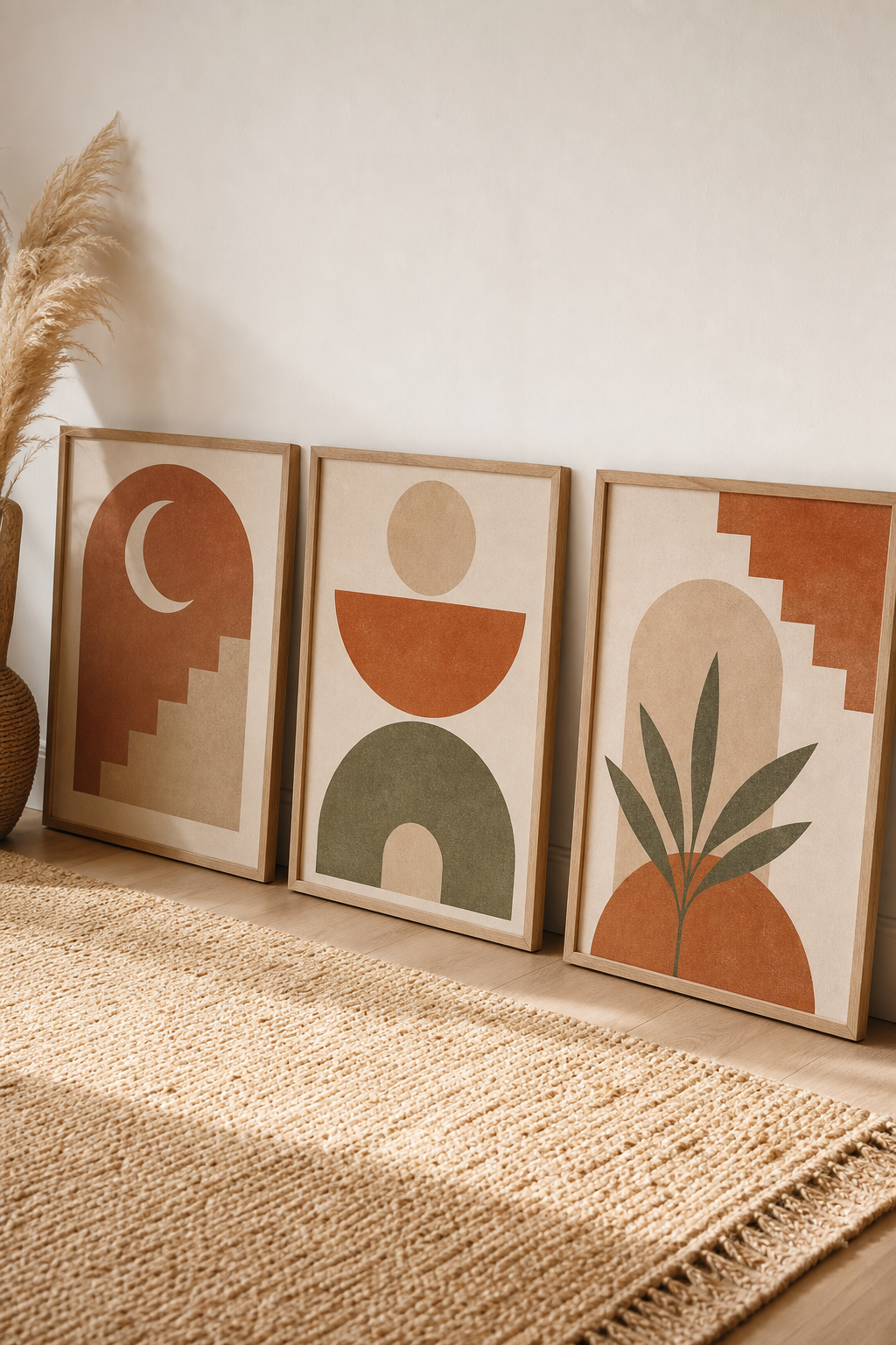
Hang related prints as a trio with even spacing and shared frame finishes. Boho geometric sets and botanical line bundles look especially strong as a rhythmic gallery wall. Measure gaps with a card or tape so spacing stays consistent. When the print quality is clean, the room feels calmer — which is the whole point of quiet art, and the reason careful printing is worth those extra few minutes.
If a print still looks soft after following these steps, check that you opened the high-resolution file rather than a social preview image. Re-download from your purchase folder, print one test sheet, and only then run the full set. A five-minute verification saves both ink and disappointment.